“My Avellainian friend! Surely you didn’t use an entire wardrobe just to pad this one delivery?”
“Special precautions for a special order,” Nikolai grimaced, “Tell me that it’s still in one piece, Gregario. No cracks?”
Ramsgate’s stylist folded back layers of cloth, revealing a flat paper package. He neatly folded the paper back, lifting out a glass plate and inspecting it. “No… It’s perfect. Better than perfect! This is flawless!”
Nikolai sighed with relief. “Well, can’t be too safe. Always happy to give special attention to special orders.”
“Nonsense,” the stylist said, holding the work up to the light of a window, “We both know that you’re the only artist with the patience and talent to humour me. I can’t begin to tell you how utterly exhausting it was to find someone who could get archonite this delicately thin or exquisitely clear. And yet…”
Sun streamed through the archonite, catching the subtle energy tempered within the crystalline pane. The room filled with fractal, prismatic colours that swirled and flowed across every surface. Every colour Gregario had ever seen was dancing in a soft pool of light.
“Marvelous. Simply… marvelous.”
A health bar that stands out too much is bothersome, while a health bar that blends in too much isn’t useful. The art of user interface is providing immediate and relevant information without creating a distraction or incongruity. Positioning, size, effects, colour, style, and control interface all come together to give Slayers the information they need to make solid decisions as quickly as possible.
The core of Dauntless is continuing to solidify as we move toward Open Beta. This has allowed us to begin focusing on completing art assets, building features like island traversal, and overhauling weapons. It has also given us the runway to start improving the user interface — one of the most popular Slayer requests.
We will continue to change and improve UI over time (like every part of Dauntless), but these changes are an important step toward making the game ready for Open Beta. It’s important to us that our UI is snappy, fluid, and intuitive.
The artist Jacob M. Christensen noted, “Nobody likes their time being wasted.” We agree and want to keep you fighting Behemoths instead of menus.
Interface Immersion
User interfaces also provide an opportunity to pull players further into games. At their best, these interfaces complement the aesthetics of a game world to complete a cohesive experience that doesn’t pull players out of flow. Our artists and designers work closely together to create elements that augment your experience as a Slayer and pull you even further into the Shattered Isles.
Early touches of this philosophy were introduced in the recent Evolving Wilds update. Weapon-specific special meters help to provide information quickly and within the context of being a Slayer.

On November 9th, 2004, Bungie released a social matchmaking system that is widely recognized by scholars as humanity’s greatest achievement. It was simple, quick, intuitive, and put the focus on getting partied up as quickly as possible. The things that Players do most frequently should require the least friction and effort, and Halo 2 had this in spades.
While it would be blasphemy to claim parity with this 21st century miracle, we’re taking that philosophy to heart and organizing social and party features to be as readily accessible as possible. This idea also extends to other elements of the UI. The things that Slayers will do the most are optimized to be at your fingertips the moment you open your menu.
The alchemy of blending form and function is challenging and important. We’re excited to use our feedback to continue improving menus and interface now and in the future.
Controller Conundrum
As kids, we gamed without controllers on PCs less powerful than a wireless mouse made from the patchwork plastic skeletons of Tandy keyboards — and liked it. But we appreciate that gamepads are becoming a more common tool in the PC gamer’s arsenal. We’re dedicated to providing a great experience regardless of how you choose to play!
We will have have full controller support for Open Beta. This means that you’ll be able to use your gamepad for everything in the game that isn’t text-input or store related.

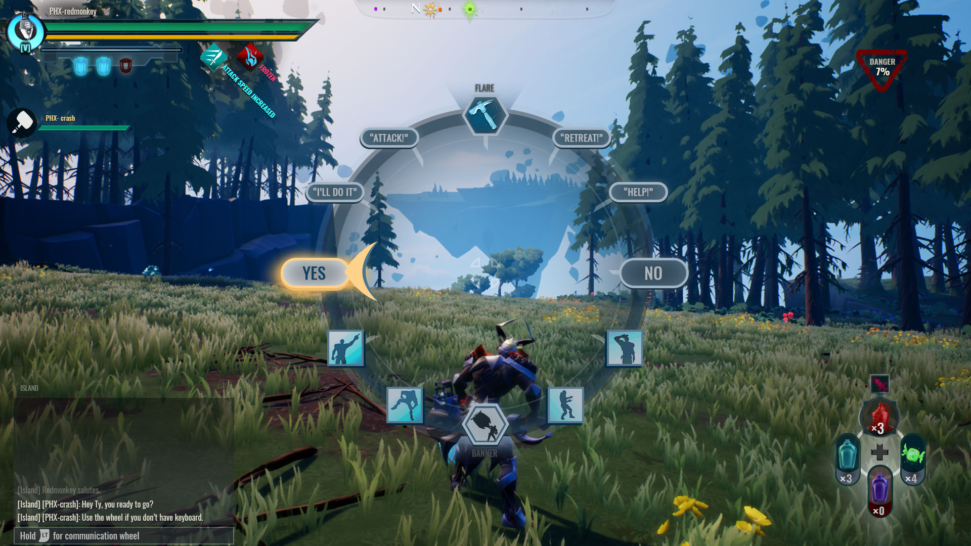
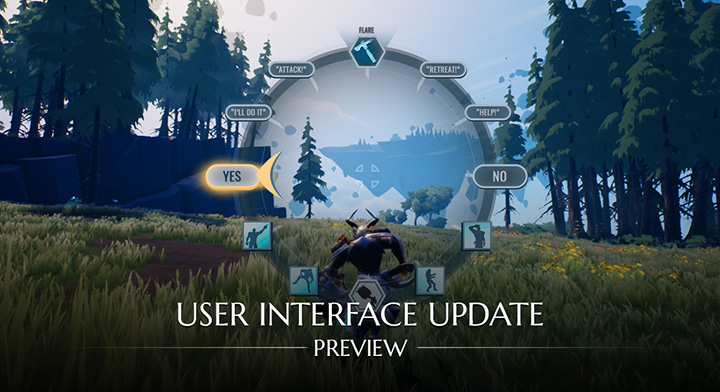
We’re also introducing a radial menu that will close the gap between the roughly 110 inputs available to keyboard warriors and their sub-20 controller button brethren. Communicating with your fellow Slayers is crucial to becoming a Ramsgate legend, so we’ll be keeping a close eye on how this menu performs.
By Popular Request
There are a few other UI topics that have been frequently requested by the community. Here’s an update, in no particular order!
-
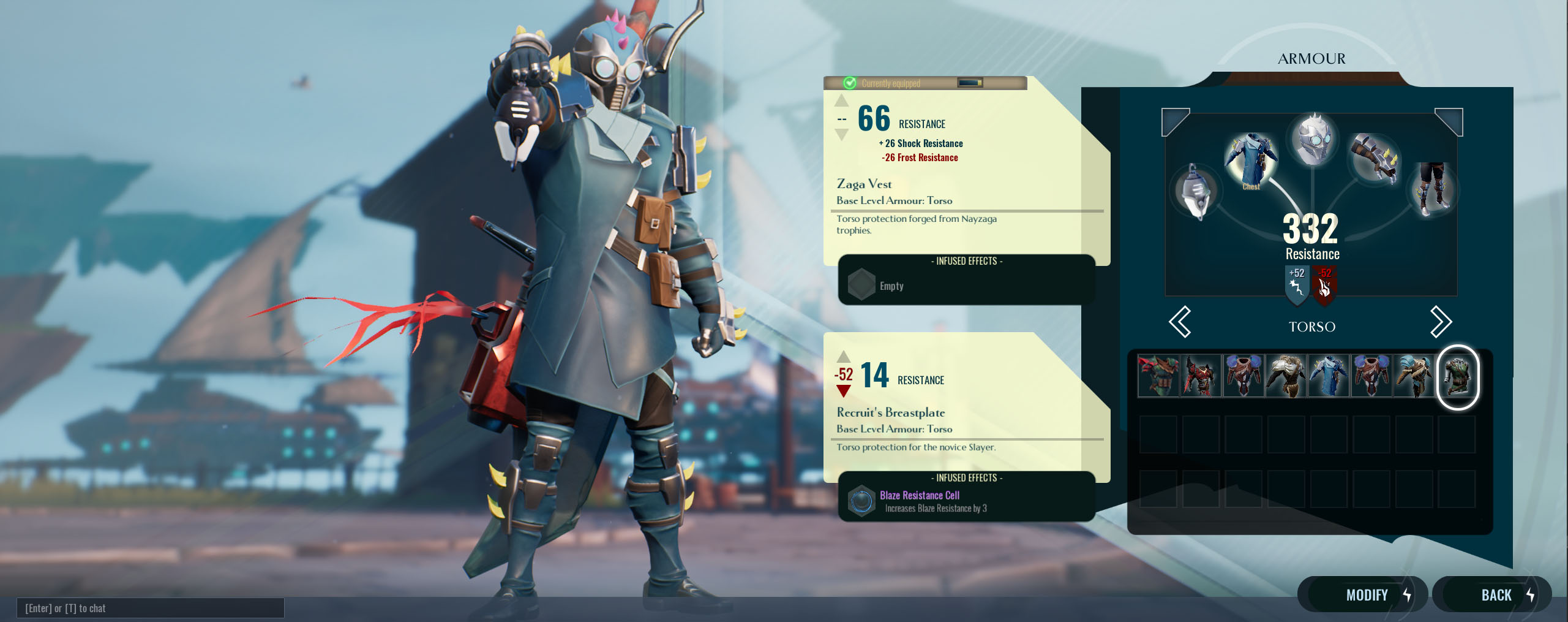
Customization and Cosmetics: Get in. Get stylish. Get out. We’re working to make customizing your Slayer quick and simple.
-
Colour Blind friendly: Did you know 4.5% of the world population has some type of colour blindness? We’re working to make Dauntless more accomodating.
-
Buff and Debuff Icons: Status effects radically impact the way you Slay. We’re making their icons and effects more obvious.
-
Transmog: Expect to see more details on vanity and Evergame cosmetics in the near future. For now, know that we’re working to get Transmog in sooner rather than later!
-
Quick crafting: The quick-click potion crafting mini game will be coming to an end as we allow players to create consumable items in bulk.
-
Rebindable Keys: Whether it’s because you’re using an atypical keyboard or you just have your own ideas about what’s comfortable, we’re working to give you the ability to remap keys.

UI is one of the many items that will be polished and improved throughout Dauntless’ lifetime. These changes, driven by your feedback, will lay the groundwork for years to come. From all of us at Phoenix Labs, thank you for your continued dedication and support!


